|
|
|
Ratsreign
Florida Panthers |
|
 |
Location: Mo can stay awhile, FL
Joined: 10.27.2017
|
|
|
|
|
"I think there’s an element of new ownership trying to remove the “dark days” of complacency, questionable trades, lackluster and uninspired play. Which I understand. Maybe they felt that logo was associated with losing and they were looking for the clean slate."
I think you're on to something here, Matt. Except the logo was just about the only good thing about this team for too many years. Instead of rebranding, I would've rather heard them say, "We're hitting reset and going back to the originals...as we transform this organIzation into a perennially competitive outfit which the first few years seemed to indicate they would be." I know another reason for the change is that there were "marketing issues" with the original logo, as in it was very hard to reproduce in smaller sizes (like on hats). That's why they "cleaned up" the leaping cat into the current (now unused) version. I can't say with certainty, but I don't think there's much "leapy" merchandise available at Pantherland, either.
While I also admire the reasoning behind/inspiration for the new logo, the arm badge of the owner's military unit. But that's also it's biggest problem....it just looks like an oversized arm patch. And writing "Panthers" across the top of a picture of a Panther is pretty lame, looks like a sign you'd see at a zoo, or something. I prefer the logo on the road whites where it says "Florida", instead. I think I'd rather see the current armpatch (panther prowling over "state" flag) as the main logo more than the "mature" new Panther logo.
I'm glad to see the iconic palm tree/stick being brought back, in a small way, at least. Idk if their pride in their new logo creation will allow them to put "Leapy" on a third jersey. If they like money, they should do it, but part of me thinks they might not want to see how much more popular it would be over the current logo.
Of the four logos, (new version of Leapy, stick&tree, prowling Cat over flag, new main logo) the new main logo comes in a distant fourth...imo.
They should have pouncing/leaping Panther as main crest. Road jerseys have prowling cat/state flag on arm, while home jerseys have stick/palm tree on shoulder. The now main crest would make a nice helmet sticker... |
|
Shynes57
Florida Panthers |
|
Joined: 11.12.2019
|
|
|
|
|
You wouldn't have believed my room growing up it was insane with Panther stuff. I was particularly proud of it considering North of the border its hard to find a hat let alone the catalogue I was able to collect. My bedding and curtains were sadly NHL and not just the Panthers but the rest of my room was strictly Panthers stuff. I don't know enough about this site to know if we can post pictures but once the COVID nonsense calms down I can try and get a picture to show. Its mostly still in tact at my folks place although not close to its one-time glory |
|
|
|
|
|
|
In New Jersey, the team now trots out the old Red and Green 'Christmas Tree' uniforms a few time a year. The fans love them even if they were pretty hideous back in the day. I suspect the green is now a darker shade to make them look better but not sure. We did so much losing in those uniforms there is no reason Florida can't trot out the Leaping Cat. Do you guys ever do that?
I always hated the palm trees patches because you know... hockey is a cold weather sport and palm tress aren't normally anywhere near ice. I think the new main logo would actually look good as a side patch.
|
|
|
|
|
|
You wouldn't have believed my room growing up it was insane with Panther stuff. I was particularly proud of it considering North of the border its hard to find a hat let alone the catalogue I was able to collect. My bedding and curtains were sadly NHL and not just the Panthers but the rest of my room was strictly Panthers stuff. I don't know enough about this site to know if we can post pictures but once the COVID nonsense calms down I can try and get a picture to show. Its mostly still in tact at my folks place although not close to its one-time glory
- Shynes57
Would love to see it! |
|
|
|
|
|
"I think there’s an element of new ownership trying to remove the “dark days” of complacency, questionable trades, lackluster and uninspired play. Which I understand. Maybe they felt that logo was associated with losing and they were looking for the clean slate."
I think you're on to something here, Matt. Except the logo was just about the only good thing about this team for too many years. Instead of rebranding, I would've rather heard them say, "We're hitting reset and going back to the originals...as we transform this organIzation into a perennially competitive outfit which the first few years seemed to indicate they would be." I know another reason for the change is that there were "marketing issues" with the original logo, as in it was very hard to reproduce in smaller sizes (like on hats). That's why they "cleaned up" the leaping cat into the current (now unused) version. I can't say with certainty, but I don't think there's much "leapy" merchandise available at Pantherland, either.
While I also admire the reasoning behind/inspiration for the new logo, the arm badge of the owner's military unit. But that's also it's biggest problem....it just looks like an oversized arm patch. And writing "Panthers" across the top of a picture of a Panther is pretty lame, looks like a sign you'd see at a zoo, or something. I prefer the logo on the road whites where it says "Florida", instead. I think I'd rather see the current armpatch (panther prowling over "state" flag) as the main logo more than the "mature" new Panther logo.
I'm glad to see the iconic palm tree/stick being brought back, in a small way, at least. Idk if their pride in their new logo creation will allow them to put "Leapy" on a third jersey. If they like money, they should do it, but part of me thinks they might not want to see how much more popular it would be over the current logo.
Of the four logos, (new version of Leapy, stick&tree, prowling Cat over flag, new main logo) the new main logo comes in a distant fourth...imo.
They should have pouncing/leaping Panther as main crest. Road jerseys have prowling cat/state flag on arm, while home jerseys have stick/palm tree on shoulder. The now main crest would make a nice helmet sticker...
- Ratsreign
We’re agreed about “Leapy.” Haha.
Totally think there’s an element of not wanting to offer the old logo because they know it’ll sell like crazy and is viewed in a better light than the new one.
I actually enjoy the new shoulder patch, too. |
|
|
|
|
|
In New Jersey, the team now trots out the old Red and Green 'Christmas Tree' uniforms a few time a year. The fans love them even if they were pretty hideous back in the day. I suspect the green is now a darker shade to make them look better but not sure. We did so much losing in those uniforms there is no reason Florida can't trot out the Leaping Cat. Do you guys ever do that?
I always hated the palm trees patches because you know... hockey is a cold weather sport and palm tress aren't normally anywhere near ice. I think the new main logo would actually look good as a side patch.
- Queenie_5_hole
I absolutely love the “Christmas tree” sweater, man. One of my all-time favorites in hockey history!
|
|
Ratsreign
Florida Panthers |
|
|
Location: Mo can stay awhile, FL
Joined: 10.27.2017
|
|
|
|
I always hated the palm trees patches because you know... hockey is a cold weather sport and palm tress aren't normally anywhere near ice. I think the new main logo would actually look good as a side patch.
- Queenie_5_hole
Lol, that's exactly what makes that patch so awesome. And those feelings about it, which many share, has actually always made me like it even that much more. 😉 Yeah beahches! palm trees & hockey. |
|
Ratsreign
Florida Panthers |
|
|
Location: Mo can stay awhile, FL
Joined: 10.27.2017
|
|
|
|
We’re agreed about “Leapy.” Haha.
Totally think there’s an element of not wanting to offer the old logo because they know it’ll sell like crazy and is viewed in a better light than the new one.
I actually enjoy the new shoulder patch, too.
- Matt Ross
Yeah, you mentioned in your blog how they got a little defensive about their new giant armpatch logo when it was revealed and lukewarmly accepted. They could at least compromise on a third jersey, old logo on the newer jersey style. But, I don't think they're in any hurry to find out how much more popular the original (even their retooled version) logo would be. So, maybe they'll eventually just go full retro first year replica for a third jersey. You can't beat the original home white jerseys.
I think the new arm patch is pretty damn cool. I loved the stick&tree, but I think the new arm patch is the best part of the whole new look. |
|
|
|
|
|
Lol, that's exactly what makes that patch so awesome. And those feelings about it, which many share, has actually always made me like it even that much more. 😉 Yeah beahches! palm trees & hockey.
- Ratsreign
If it makes sense and has appeal to people in Florida and the fan base then that's great. Just as an outsider I was a always a bit thrown by it.
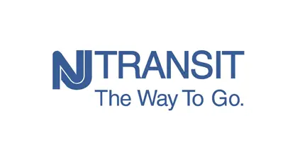
The NJ Devil's interlocking letter logo was actually 'inspired' by the NJ Transit (Bus/Train) logo which is pretty sad but true. If I was an idiot when it comes to technology I'd insert a picture of it.
|
|
|
|
|
|
If it makes sense and has appeal to people in Florida and the fan base then that's great. Just as an outsider I was a always a bit thrown by it.
The NJ Devil's interlocking letter logo was actually 'inspired' by the NJ Transit (Bus/Train) logo which is pretty sad but true. If I was an idiot when it comes to technology I'd insert a picture of it.
- Queenie_5_hole
No kidding? I just looked it up. Is this the one you’re referencing?
 |
|
|
|
|
|
Yeah, you mentioned in your blog how they got a little defensive about their new giant armpatch logo when it was revealed and lukewarmly accepted. They could at least compromise on a third jersey, old logo on the newer jersey style. But, I don't think they're in any hurry to find out how much more popular the original (even their retooled version) logo would be. So, maybe they'll eventually just go full retro first year replica for a third jersey. You can't beat the original home white jerseys.
I think the new arm patch is pretty damn cool. I loved the stick&tree, but I think the new arm patch is the best part of the whole new look.
- Ratsreign
I def remember fans being mixed on it and some defensive rebuttles.
A retro white would be awesome! How about leaping cat as the main, tree/stick as the shoulder and just the prowling cat as the bucket decal? Or...I think “Florida” or “Panthers” in plain contrasting white or navy (depending on helmet color) font on the side of the helmet would be cool. Kind of an old school look like how some teams used to do.
|
|
|
|
|
Ratsreign
Florida Panthers |
|
|
Location: Mo can stay awhile, FL
Joined: 10.27.2017
|
|
|
|
I def remember fans being mixed on it and some defensive rebuttles.
A retro white would be awesome! How about leaping cat as the main, tree/stick as the shoulder and just the prowling cat as the bucket decal? Or...I think “Florida” or “Panthers” in plain contrasting white or navy (depending on helmet color) font on the side of the helmet would be cool. Kind of an old school look like how some teams used to do.
- Matt Ross
Hell yeah 👍 that sounds good to me. |
|
|
|
|
|
No kidding. In fact below is an early rendering used by the team which makes it even more obvious. But I actually read about the connection to NJ Transit somewhere. The logo below was used for some press briefings when the team first moved to New Jersey and there are pictures of this behind the original team owner (Dr. John McMullen) and Chico Resch when he was our 'star' goalie.
https://www.bing.com/imag...ajaxhist=0&vt=0&eim=1,2,6
Sorry, I don't have the skills to post the image directly.
Found the old press photo:
https://www.bing.com/imag...ajaxhist=0&vt=0&eim=1,2,6
Never saw this one before but even better:
https://farm6.static.flic...47647511_96a64a91e2_o.png
- Queenie_5_hole
Thanks for sharing. I actually remember seeing that before when looking back at these.
I actually don’t think that was too bad of a design. |
|
|
|
|
|
Hell yeah 👍 that sounds good to me.
- Ratsreign
💪💪💪 |
|
|
|
|
Ratsreign
Florida Panthers |
|
|
Location: Mo can stay awhile, FL
Joined: 10.27.2017
|
|
|
|
|
|
|
|
I'm pretty sure Pantherland at BB&T Center has items with the leaping Panther. But, it's been a month off now and the memory is fuzzy. I would expect the jerseys to be long gone, but there are various shirts, pucks, etc.
I distinctly remember Trocheck jerseys at 50% off.
The new logo has grown on me over the past few years. I'm used to it now and don't really miss the leaping Cat anymore. |
|
|
|
|
|
I'm pretty sure Pantherland at BB&T Center has items with the leaping Panther. But, it's been a month off now and the memory is fuzzy. I would expect the jerseys to be long gone, but there are various shirts, pucks, etc.
I distinctly remember Trocheck jerseys at 50% off.
The new logo has grown on me over the past few years. I'm used to it now and don't really miss the leaping Cat anymore.
- JimboCoppertone
Jimbo - Good to hear from you, my friend! It’s been awhile.
Thanks for weighing in. |
|
|
|
|
|
|
|
|
https://images.app.goo.gl/qjYdg3sYs9vQnLCQ6
- Ratsreign

That picture kills me every time I see it. |
|
Ratsreign
Florida Panthers |
|
|
Location: Mo can stay awhile, FL
Joined: 10.27.2017
|
|
|
|
|
The latest scenario for finishing the season is a 24 team tourney. Top six in each division play a best of three(?) to see who makes the "playoffs". 1vs2 to determine division winner (no elimination), 3v6 and 4v5 to see who moves on to face teams 1 & 2. Although this plan eliminates the wildcard, it is probably the best way (proposed so far, anyway) to reach a conclusion.
Panthers would play the Habs for the right to face either TB or the Bs.
Lol, here comes the long awaited intrastate Panthers vs Lightning playoff series, but will be played in Buffalo or somewhere in Canada... |
|
|
|
|
|
The latest scenario for finishing the season is a 24 team tourney. Top six in each division play a best of three(?) to see who makes the "playoffs". 1vs2 to determine division winner (no elimination), 3v6 and 4v5 to see who moves on to face teams 1 & 2. Although this plan eliminates the wildcard, it is probably the best way (proposed so far, anyway) to reach a conclusion.
Panthers would play the Habs for the right to face either TB or the Bs.
Lol, here comes the long awaited intrastate Panthers vs Lightning playoff series, but will be played in Buffalo or somewhere in Canada...
- Ratsreign
Would be funny if it was in Florida and the player’s parents had to drive them like they were back in peewee. Haha. |
|


